
Design moves fast. What felt fresh six months ago can already look dated, and the tools designers use are evolving just as quickly. Whether you are building a mobile app, redesigning a website, or creating a brand identity from scratch, staying current with design trends is not about chasing fads. It is about understanding the direction the industry is moving and making informed creative decisions.
Key Takeaways
- 1. AI-Assisted Design Workflows
- 2. Bold and Expressive Typography
- 3. Immersive 3D and Spatial Design
- 4. Bento Grid Layouts
This guide breaks down the most significant UI and graphic design trends that are defining visual culture right now. Some are brand new, others are evolutions of ideas that have been building for years. All of them are worth paying attention to.
1. AI-Assisted Design Workflows
Artificial intelligence is no longer a novelty in the design world. Tools like Figma''s AI features, Adobe Firefly, and Midjourney are now embedded in everyday workflows. Designers use AI to generate initial concepts, explore color palettes, create placeholder imagery, and even produce production-ready assets.
The key shift in 2026 is that AI is being treated as a collaborator rather than a replacement. The best designers use AI to speed up the exploratory phase, generating dozens of layout variations in minutes, then apply their expertise to refine the results into something meaningful. The human eye for context, emotion, and brand alignment remains irreplaceable.
One practical example: a UX team might use AI to generate 50 different hero section layouts, filter them based on conversion data from previous projects, and then hand-customize the top three candidates. This workflow cuts initial concept time by roughly 70 percent while maintaining design quality.
2. Bold and Expressive Typography
Minimalist sans-serif fonts dominated the last decade, but the pendulum is swinging. Designers are now embracing oversized, expressive, and even experimental typography as a primary visual element rather than just a vehicle for text.

Variable fonts are a major enabler of this trend. A single variable font file can contain infinite weight, width, and slant variations, allowing designers to create dramatic typographic hierarchies without loading multiple font files. This is especially important for web performance.
Expect to see more kinetic typography on websites, where text animates in response to scroll position or cursor movement. Brands like Stripe and Linear have popularized this approach, and the tools to implement it have become much more accessible through libraries like GSAP and Framer Motion.
3. Immersive 3D and Spatial Design
Three-dimensional elements in UI design have moved well beyond novelty. With the maturation of WebGL, Three.js, and Spline, adding interactive 3D elements to websites and apps is now practical for teams of all sizes. Apple''s continued push into spatial computing with Vision Pro has further accelerated interest in designing for three-dimensional spaces.
The most effective implementations are subtle. Rather than building entire 3D worlds, smart designers add depth through floating product renders, interactive model viewers, or parallax effects that give flat interfaces a sense of dimension. The goal is enhancement, not spectacle. For more on this, see How Good Design Shapes Brands, Apps, and User Trust.
For product pages in particular, interactive 3D viewers have shown measurable improvements in engagement. Users who interact with a 3D product model spend significantly more time on the page and convert at higher rates compared to those viewing static images alone.
4. Bento Grid Layouts
The bento grid, inspired by Japanese bento box compartments, has become one of the defining layout patterns of recent years. Apple popularized it in their product pages, and it has since spread across portfolios, dashboards, and marketing sites.

What makes bento grids effective is their ability to present diverse content types in a visually cohesive way. Each cell can contain different content, such as text, images, statistics, or interactive elements, while the overall grid provides structure and rhythm. The asymmetry keeps things visually interesting without feeling chaotic.
When implementing bento grids, pay attention to responsive behavior. A grid that looks stunning on desktop needs careful consideration for tablet and mobile breakpoints. CSS Grid and Subgrid make this much more manageable than it was even two years ago.
5. Glassmorphism and Layered Transparency
Glassmorphism, the frosted glass effect that layers semi-transparent elements over colorful backgrounds, continues to evolve. The trend has matured beyond the initial hype cycle and settled into a useful tool in the designer''s toolkit.
Modern implementations combine backdrop blur with subtle borders and gradients to create depth and hierarchy. The effect works particularly well for overlay menus, card components, and navigation bars where you want to maintain awareness of background content while focusing attention on foreground elements.
Performance is a legitimate concern with backdrop-filter effects. Test on lower-powered devices and consider providing a solid-color fallback for browsers or devices that struggle with the blur calculations. Progressive enhancement remains the best approach.
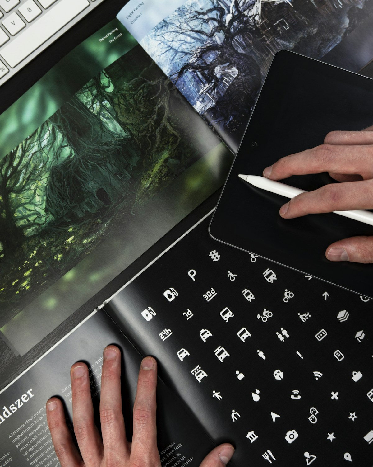
6. Dark Mode as the Default
Dark mode has shifted from a nice-to-have toggle to the default presentation for many apps and websites, particularly in creative, developer, and productivity tools. There are good reasons for this beyond aesthetics. Dark interfaces reduce eye strain in low-light environments, can save battery on OLED screens, and make colorful content and imagery pop against the darker background.
Designing for dark mode is more nuanced than inverting colors. You need to think about contrast ratios, the way shadows behave on dark surfaces, and how your color palette translates. Pure black backgrounds can feel harsh, so most successful dark mode designs use dark grays like #1a1a1a or #121212 as the base, reserving true black for specific accent purposes.
7. Micro-Interactions and Haptic Feedback
Small, purposeful animations that respond to user actions continue to gain importance. A button that subtly bounces when tapped, a toggle that smoothly slides with a satisfying easing curve, or a form field that gently shakes when validation fails are all examples of micro-interactions that make interfaces feel alive and responsive.
The trend in 2026 is toward more refined and purposeful micro-interactions rather than more of them. Every animation should serve a purpose: confirming an action, drawing attention to a change, or provi For more on this, see African Union Summit Focuses on Continental Free Trade Progress.ding feedback. Gratuitous animation that slows down task completion is being replaced by carefully timed interactions that enhance usability.
On mobile platforms, pairing visual micro-interactions with haptic feedback creates a multi-sensory experience that significantly improves perceived quality. Apple''s Taptic Engine and Android''s haptic API provide fine-grained control over vibration patterns that complement visual animations.
8. Sustainable and Accessible Design Practices
Sustainability in design is gaining traction as teams become more conscious of the environmental impact of digital products. Every image loaded, every animation rendered, and every unnecessary HTTP request contributes to energy consumption. Sustainable design practices like optimizing image formats, reducing animation complexity, and choosing energy-efficient color palettes, with darker colors consuming less power on OLED screens, are becoming standard considerations in design systems.
Accessibility, meanwhile, is finally being treated as a core design requirement rather than an afterthought. The upcoming European Accessibility Act is pushing companies to meet WCAG 2.2 AA standards For more on this, see 10 Meals You Can Cook in Under 30 Minutes That Are Actually Healthy., and design tools are adding built-in accessibility checkers. Figma, for example, now highlights contrast issues in real time as you design.
The most forward-thinking teams are adopting inclusive design methodologies from the start of their projects. This means considering users with diverse abilities during the ideation phase, not just running automated accessibility audits at the end.
9. Neo-Brutalism and Anti-Design
As a counterpoint to the polished, gradient-heavy aesthetic that has dominated recent years, neo-brutalism is having a moment. Characterized by raw typography, visible borders, high contrast, and intentionally rough aesthetics, this approach draws from architectural brutalism and early web design.
Neo-brutalism works particularly well for brands that want to stand out by rejecting the expected. Creative agencies, independent publications, and cultural institutions have embraced this trend to signal auth For more on this, see 5G Changed Everything: The Real Impact Three Years Later.enticity and creative confidence. The style says: we are confident enough to be different.
When executed well, neo-brutalism is still highly usable. The key is to apply the raw aesthetic to the visual layer while maintaining clear navigation, readable typography, and logical information architecture underneath.
How to Apply These Trends Thoughtfully
The biggest mistake designers make with trends is applying them indiscriminately. Not every project needs 3D elements, and not every brand benefits from neo-brutalism. The right approach is to understand the principles behind each trend and apply them where they serve the user and the b usiness goals.
Start by auditing your current design system against these trends. Which ones align with your brand identity? Which solve existing usability problems? Which might confuse your specific user base? The answers will guide you toward the trends worth adopting and those worth watching from a distance.
Remember that trends are tools, not rules. The best designs use trends in service of clear communication and excellent user experience, not as decoration for its own sake.
Related Articles on BlogVerdict
- Canva vs Adobe Express: Which Design Tool Is Better? (Design)
- How Good Design Shapes Brands, Apps, and User Trust (Design)
Summary Comparison
| Factor | Pros | Cons | Verdict |
|---|---|---|---|
| Cost | Various options | Premium can be expensive | Good value overall |
| Quality | High standard | Varies by provider | Research recommended |
| Accessibility | Widely available | Regional differences | Improving steadily |
| Support | Community + official | Response times vary | Adequate for most |
Related Reading on BlogVerdict
Explore more on this topic:
- How Good Design Shapes Brands, Apps, and User Trust
- 10 Meals You Can Cook in Under 30 Minutes That Are Actually Healthy
- 5G Changed Everything: The Real Impact Three Years Later
- African Union Summit Focuses on Continental Free Trade Progress
- Canva vs Adobe Express: Which Design Tool Is Better?
Frequently Asked Questions
What is the main point from this article?
The most important insight is that understanding the fundamentals and staying informed about developments in this area can help you make better decisions and stay ahead of important changes.
Where can I learn more about this topic?
We recommend exploring the linked resources throughout this article, following authoritative sources in this field, and checking BlogVerdict regularly for updated coverage and analysis.


