
Most people cannot articulate why they trust one app over another or why one brand feels premium while a competitor feels cheap. But designers know the answer: it comes down to thousands of small, intentional decisions about color, spacing, typography, interaction patterns, and visual consistency. Good design does not just make things look nice. It shapes how people perceive quality, builds trust before a single word is read, and ultimately drives the business outcomes that keep companies alive. For more on this, see The Biggest UI and Graphic Design Trends Right Now.
Key Takeaways
- The Psychology of First Impressions
- How Design Builds Brand Identity
- Design and Application Usability
- Design as a Trust-Building Mechanism
This article examines the concrete ways that thoughtful design influences brand perception, application usability, and the trust that users extend to digital products.
The Psychology of First Impressions
Research in human-computer interaction consistently shows that users form opinions about a website or app within the first 50 milliseconds of seeing it. That is faster than conscious thought. In that fraction of a second, the visual design communicates professionalism, trustworthiness, and relevance, or the lack thereof. For more on this, see 5G Changed Everything: The Real Impact Three Years Later.
This snap judgment is not superficial. It is an evolved cognitive shortcut. Humans assess visual order as a proxy for competence. A well-organized, visually coherent interface signals that the people behind it are competent and detail-oriented. A cluttered, inconsistent design triggers the opposite assumption, even if the underlying product is technically superior.
Consider two banking apps with identical features. One uses a clean layout with consistent spacing, a limited color palette, and professional typography. The other has mismatched fonts, inconsistent button styles, and cramped layouts. Most users will trust the first app with their money, even without reading a single review. The design alone communicated credibility.
How Design Builds Brand Identity
A brand is not a logo. It is the total impression a company makes across every touchpoint, and design is the primary medium through which that impression is de For more on this, see African Wildlife Conservation Efforts Show Promising Results.livered. Every color choice, font pairing, icon style, and layout pattern contributes to a cumulative brand experience that users carry in their memory.

Consistency Creates Recognition
Brand recognition depends on visual consistency. When a user sees the same colors, typography, and design patterns across your website, app, emails, and social For more on this, see Canva vs Adobe Express: Which Design Tool Is Better?.media, those visual elements become mental shortcuts for your brand. This is why design systems have become essential for companies of every size.
A design system is a single source of truth for all visual and interactive components. It ensures that a button looks and behaves the same way whether a user encounters it on the marketing site, the mobile app, or an email template. This consistency builds familiarity, and familiarity builds trust.
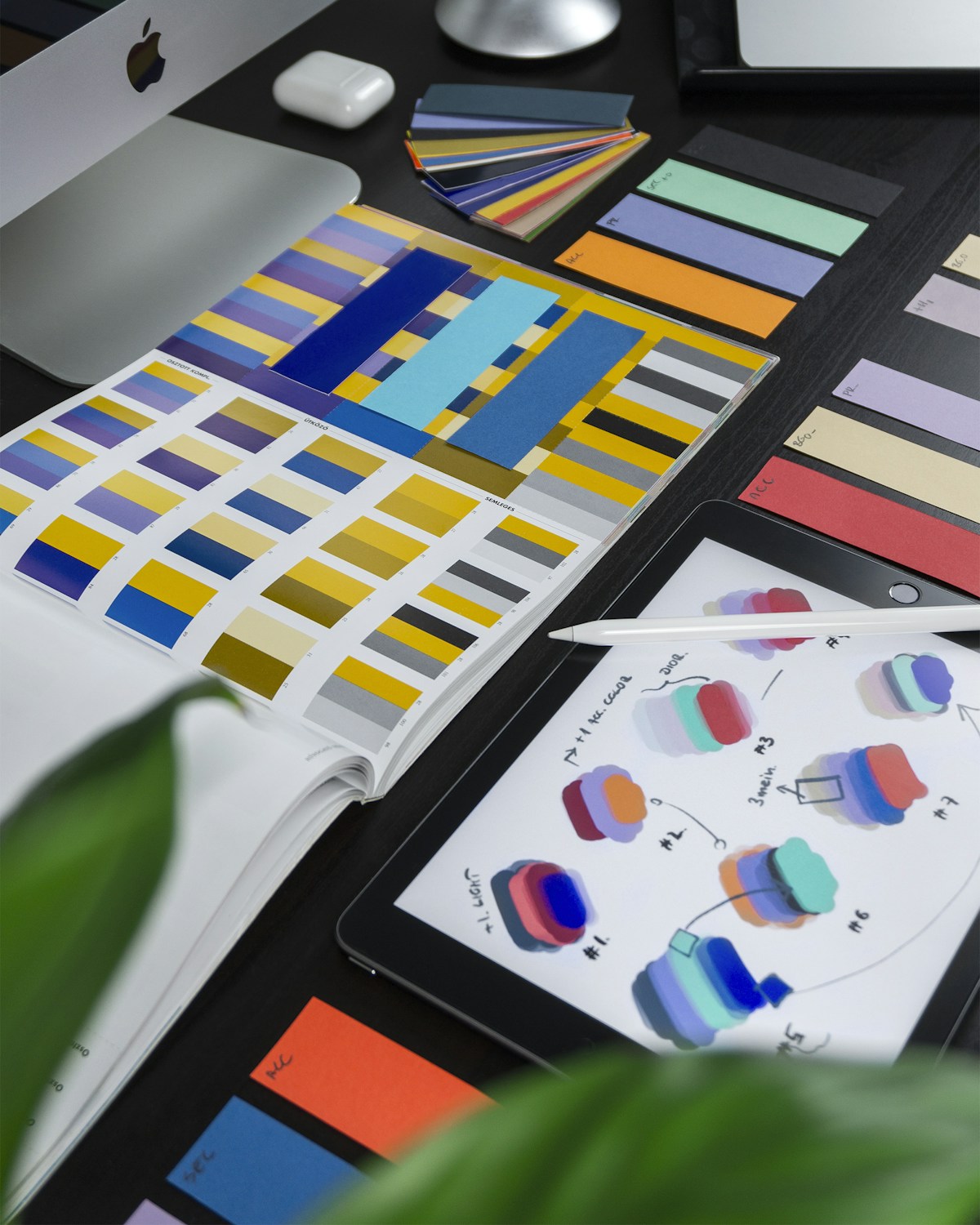
Color Psychology in Brand Design
Color is one of the most powerful tools in brand design because it operates on an emotional level. Financial institutions gravitate toward blue because it communicates stability and trust. Health and wellness brands use green to evoke nature and vitality. Luxury brands often employ black and gold to signal exclusivity and sophistication.

But color psychology is not a formula you can apply blindly. Context matters enormously. A fintech startup targeting young adults might use vibrant purple or coral instead of traditional banking blue, because their brand promise is about disrupting the status quo, not reinforcing it. The color choice should align with the brand''s specific story, not just generic color associations.
Typography as Brand Voice
If color is the emotional backdrop of a brand, typography is its voice. A geometric sans-serif like Inter or DM Sans communicates modernity and clarity. A serif like Playfair Display or EB Garamond suggests tradition, authority, and editorial quality. A monospace font signals technical expertise or developer culture.
The most distinctive brands pair fonts in unexpected ways. A luxury fashion brand might combine an elegant serif headline font with a clean sans-serif body font, creating contrast that feels sophisticated without sacrificing readability. The key is that typography choices should feel intentional, reinforcing the brand personality at every level of the text hierarchy.
Design and Application Usability
Good design is not just about looking good. It is fundamentally about making things work well for the people using them. The most beautiful interface in the world fails if users cannot accomplish their goals efficiently.
Information Architecture and Visual Hierarchy
Visual hierarchy is the design principle that guides the user''s eye through content in order of importance. It uses size, color, contrast, and spacing to create a clear reading path. Without strong visual hierarchy, users face a wall of undifferentiated content and either work harder than they should or leave entirely.
A well-designed dashboard, for example, puts the most critical metrics at the top in large, bold numbers. Secondary information appears in smaller cards below. Tertiary details are accessible but tucked away in expandable sections. The user''s attention is guided naturally from most important to least important without requiring any instruction.
Reducing Cognitive Load
Every design decision either adds to or reduces the mental effort required to use a product. Cognitive load is the total amount of mental processing power a user must allocate to understand and navigate an interface. Good design minimizes unnecessary cognitive load so users can focus their mental energy on their actual task.
Practical techniques include grouping related elements together, using consistent patterns so users only need to learn behaviors once, providing clear labels instead of relying on icons alone, and removing decorative elements that do not serve a functional purpose. Each of these decisions is invisible when done well, which is precisely the point.
Error Prevention and Recovery
How a product handles errors reveals its design quality more than anything else. Well-designed products prevent errors before they happen through smart defaults, inline validation, and confirmation dialogs for destructive actions. When errors do occur, the design provides clear, specific guidance on how to recover.
Compare a form that shows a vague red banner saying "There was an error" to one that highlights the specific field, explains what went wrong, and suggests how to fix it. The second approach respects the user''s time and intelligence, building trust with every interaction.
Design as a Trust-Building Mechanism
Trust is the currency of digital products. Users must trust an app before they will enter personal information, make a purchase, or recommend it to others. Design is the primary mechanism through which that trust is earned.
Visual Credibility Signals
Users look for specific visual cues when assessing trustworthiness. Professional photography instead of generic stock images. Consistent, error-free typography. Smooth animations that feel polished. Clear contact information and transparent pricing. Each of these elements contributes to a cumulative sense of legitimacy.
The absence of these signals is equally powerful. A single broken layout, a pixelated logo, or an inconsistent color that suggests a hastily assembled product can undermine trust that took months to build.
Transparency Through Design
Transparent design practices build trust by making the product''s behavior predictable and understandable. This means clear labeling of what data is collected and why, obvious indicators of processing states like loading spinners, and honest representation of product capabilities without dark patterns.
Dark patterns, manipulative design techniques that trick users into unintended actions, might produce short-term metrics improvements but destroy long-term trust. Hiding unsubscribe links, using confusing double negatives in privacy settings, or making the cancellation process intentionally difficult are all trust destroyers that users remember and share with others.
Accessibility as Trust
When a product is accessible, it communicates something important: we thought about you. For users with disabilities, encountering an accessible product is a trust signal that the company cares about all its users, not just the majority. For all users, accessible design translates to better usability because the principles of accessibility, such as clear contrast, logical tab order, and descriptive labels, benefit everyone.
Measuring Design Impact
Design''s impact on business outcomes is measurable, even if the connection is not always immediately obvious. Key metrics to track include conversion rates before and after design changes, task completion time and error rates from usability testing, Net Promoter Score as a proxy for trust and satisfaction, and brand recall in user surveys.
The companies that treat design as a strategic investment rather than a cost center consistently outperform those that do not. A well-designed product reduces support costs because users can help themselves. It increases conversion because trust barriers are lowered. It improves retention because the experience is pleasant enough to return to.
Putting It Into Practice
If you want to use design to strengthen your brand, improve your app, and build user trust, start with these concrete steps. Audit your current design for consistency across all touchpoints. Invest in a design system, even a simple one, to maintain visual coherence. Run usability tests with real users to identify friction points. Prioritize accessibility from the beginning rather than retrofitting it later. And measure the results so you can demonstrate the value of design investment to stakeholders.
Good design is not a luxury. It is a competitive advantage that compounds over time, building brand equity, improving usability, and deepening user trust with every interaction.
Related Articles on BlogVerdict
- Canva vs Adobe Express: Which Design Tool Is Better? (Design)
- The Biggest UI and Graphic Design Trends Right Now (Design)
Summary Comparison
| Factor | Pros | Cons | Verdict |
|---|---|---|---|
| Cost | Various options | Premium can be expensive | Good value overall |
| Quality | High standard | Varies by provider | Research recommended |
| Accessibility | Widely available | Regional differences | Improving steadily |
| Support | Community + official | Response times vary | Adequate for most |
Related Reading on BlogVerdict
Explore more on this topic:
- 5G Changed Everything: The Real Impact Three Years Later
- African Wildlife Conservation Efforts Show Promising Results
- The Biggest UI and Graphic Design Trends Right Now
- Canva vs Adobe Express: Which Design Tool Is Better?
- 10 Meals You Can Cook in Under 30 Minutes That Are Actually Healthy
Frequently Asked Questions
What is the main point from this article?
The most important insight is that understanding the fundamentals and staying informed about developments in this area can help you make better decisions and stay ahead of important changes.
Where can I learn more about this topic?
We recommend exploring the linked resources throughout this article, following authoritative sources in this field, and checking BlogVerdict regularly for updated coverage and analysis.


